
Collaboration
Design Strategies and Motivation:
Brand Vision Board Feedback:
"This is soooo close to done. The two text boxes are unnecessary and distracting from the unity of the visual."
~Bartley Argo~
Analysis:
The feedback was appropriate in aiding the design decision to keep or remove unnecessary elements on the vision board. The text boxes do take the attention away from the value of the little girl in the middle.
Fixed Mistakes:
The entire vision board was changed to better fit the brand. The white text boxes were removed. The font choices were changed to a more legible font choice. The logo was placed on the vision board. The color palette was changed to a more playful color palette. The background was changed from a brick wall to a blue sky with clouds and a bright yellow sun. In an article on the website Surpass Your Goals the author writes, "A vision board is only going to work if you know what it is you want." (Lavitch 2023). This information connects to the changes that were made to the new vision board for Greener Day Toys. The vision was redesigned to fit the idea Greener Day toys brand.
Before the feedback:

After the feedback:

Look and Feel:
“Visually, there is a general lack of consistency between the elements. It comes from a lack of consistency between the messaging and the visuals. Imagination is not a strong theme or at least it is not represented here.”
~Bartley Argo ~
Analysis of the feedback:
The elements change within the brand's design for Greener Day Toys. The images did not fit the message. The theme of imagination was not a strong theme, and the theme was not shown within the Greener Day Toys brand. This feedback was appropriate for the brand because the feedback pointed out the issues that were not easily seen due to design blindness.
Fixed Mistakes:
The design elements were consistently placed for each design asset created for the Greener Day Toys brand. The theme was changed from imagination to a toy story. The reason behind the new theme is so kids can use their imaginations to see new shapes and ideas in the clouds. This idea is rooted in the idea of kids having their heads in the clouds.
Before the feedback:

After the feedback:

Feedback from Design Integration:
Logo Sketches:
“You have presented the 30 sketches, and each is organized well. You have included the name of the brand. The 3 selected are simple which is good, but do they offer enough differentiation? How do the designs fit the theme?"
~Adam Baldowski~
Analysis of the feedback:
The feedback for the logo sketches was appropriate and helped me question the thought process while creating the logo design for Greener Day Toys. The necessary changes and choice-making were heavily thought of while picking the right logo design for the Greener Day Toys brand. According to a blog on the Wix website "Simplicity: A good logo should be simple and easy to understand. Avoid complex designs that can be difficult to remember or reproduce." (Goldstien 2023). This definition from the article about making a good logo helped aid the changes made so the logo would best fit the brand.
Final logo design choice:
The design with the sun was chosen for the final logo choice. However, there still needed to be changes made. The logo originally had a sun on top and the company name below it. Then the idea of having a kite flying through a big blue sky came to mind and the sun was then moved to look as if it was popping out from behind the kite. The sun was already shining in the sky and the idea of having two suns in the sky did not make sense. So the sun was removed from the logo altogether and the kite idea was chosen. Only the logo was not finished. The lines inside the kite would get blown out and you wouldn't be able to see them when the image was shrunk down in size. So the lines were removed and now the logo was complete.
Begining Sketches:

Logo Option 1:

Logo Option 2:

Logo Placement Options:

Final Logo Choice:

Multi-Platform Delivery:
Feedback for media assets:
"Be careful to maintain consistent proportions when using and placing elements. Do not squeeze-to-fit-fit. The social media treatments have strong branding -- your bright, graphic treatment is helpful with brand presence and continuity"
~Andrea Kratz~
Analysis:
The elements for the media assets match the rest of the Greener Day Brand. One issue with the design was that some of the images were squished. A major design rule is to never squeeze images. An author for 99 Designs wrote, "Proportion can be achieved only if all elements of your design are well-sized and thoughtfully placed." (Reid 2021). The article explains how sizing matters in accomplishing good design proportions.
Fixed Mistakes:
The image in question was replaced with a non-squished version. Changing the proportion of the design.
The Fixed Image:
The incorrect sized image:

Instagram AD:

Facebook Ad:

X AD:

Feedback for Swag:
"The swag clothing is a strong echo of the brand and its blue-sky look, as are the cups, mugs, and bags. This group of media extends the brand look and feel well. The bus stop works nicely as a triptych with the kite sailing through, and the bus wrap is a clean match."
~Andrea Kratz~
Analysis:
The swag design is consistent with the rest of the brand designs making the brand recognizable. "While you need to be careful about the way you brand company swag to ensure it’s attractive and wearable, it’s also important to ensure you clearly identify your brand." (Blechynden 2021). This means that when designing the swag for Greener Day Toys the idea was to keep the elements the same as the other parts of the brand so that the brand would be easily recognized by the customers.
Fixed Mistakes:
There were a few mistakes that were fixed. One was making sure the patterns were simplified enough that the brand was recognizable and so the images were not cluttered. Another fixed mistake was taking a 3D image off one of the designs because the 3D image did not match the rest of the design.
Before The Changes


After The Changes


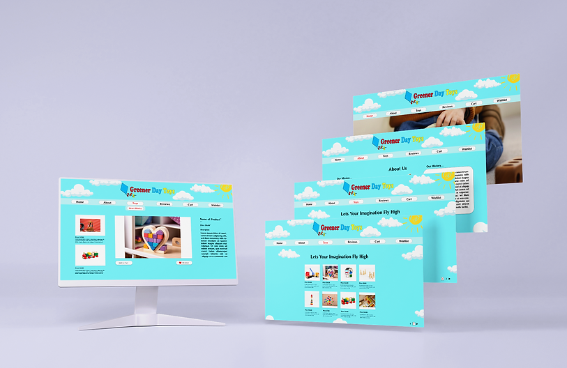
Website:
"You worked hard to simplify and declutter the basic brand concept so that its bright and happy design could come through."
~Andrea Kratz~
Analysis:
The website was cluttered. There was a video animation on the home page full of clouds. The About page originally had a cloud inside the cloud there was history about how Greener Days Toys started and their mission. The item page had way too many items on it.
Fixed Mistakes:
Clouds were removed to simplify the web design. The video animation was removed from the home page and an image was put in its place. The cloud on the home page was also removed. The company history was written in its own box and the mission was in another. This separates the content to make it easier for the audience to keep their attention on the information.
Before The Changes:


After The Changes:


Final Website:
Measuring Design Effectiveness:
Brand Playbook:
Self-Evaluation:
Week One:
Needs improvement due to the lack of details on what Greener Day Toys has to offer. The designer came to this conclusion when she realized the design was there, but it lacked information about the brand. Greener Day Toys is a toy company, yes, but there is more to their story. The information needed to be pushed a little further. The designer went back and added to the brand's information about the benefits of Greener Day Toys. The benefits aren’t just for the children but for the parents as well.
Self-Evaluation
Week Two:
The information still didn’t feel right for the brand playbook. The Greener Day Toys Playbook still needs more improvement for the brand's look and feel. The designer wanted the playbook to be completely different from the example given. Instead of a business-looking playbook that comes off as professional. She wanted the playbook she was designing to look more like a children’s book. The designer wanted Greener Day Toys' entire design to be targeted toward the person who would have the most interaction with Greener Day Toys products.
Self-Evaluation
Week Three
The brand's look and feel is unique and can stand on its own. The consistency throughout the brand makes Greener Day Toys a strong brand that can stand out from other brands them.
The Visual Hierarchy is good. You can see the most important parts are bigger and stand out so the viewer can see them. The overall brand is consistent. The elements run smoothly throughout the entire brand and do not veer off from the original plan to keep the brand noticeable to children.
Reference:
Lavitch, R. (2023). Avoid These Common Vision Board Mistakes. Article. Surpass Your Goal. https://www.surpassyourgoals.com/2020/12/avoid-these-common-vision-board-mistakes/
Goldstien, K. (2023). How to make a good logo: the dos and don’ts. Blog. Wix Blog. https://www.wix.com/blog/good-logo-design-tips?experiment_id=%5E%5E433896974311%5E%5E_DSA&gclid=Cj0KCQiApOyqBhDlARIsAGfnyMoLsHnb2o07T2EmGuqobRd-g049mvEYOKpY7Yfghb6_Jyhdiwb7ra8aAqNwEALw_wcB&utm_campaign=9823943661%5E102253749073&utm_medium=cpc&utm_source=google
Reid, M. (2021). The 7 principles of design and how to use them. Blog. 99designs. https://99designs.com/blog/tips/principles-of-design/
Blechynden, D. (2021). 10 Tips to Design Company Swag That People Will Actually Wear. Article. Top10.com. https://www.top10.com/promotional-products/10-tips-to-design-company-swag-that-people-will-actually-wear